''People are drawn to clarity and away from confusion.”
Donald Miller
Did you know that most users stay on a website for less than 15 seconds? According to marketing guru Donald Miller, our lazy brains don’t like having to work too hard to figure out what it needs to do. Users will give up if they cannot determine the following 3 things quickly when they land on your website:
- What you offer?
- How will it help them?
- What do they need to do to buy it?
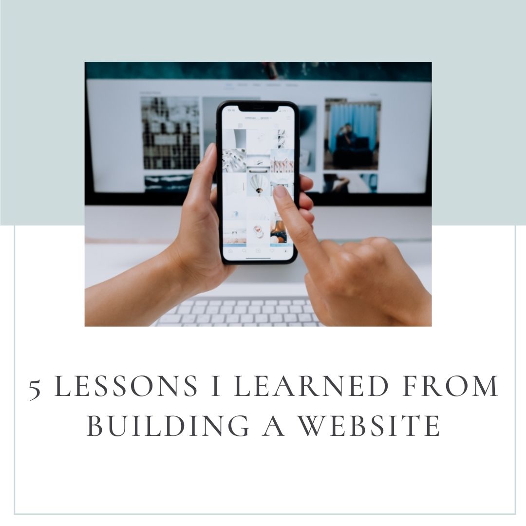
Here are 5 lessons I learned to create clarity so the user understands the offer being made, why they need it and what to do to get it.
A header that clearly states what you do and who you help
Use a big a bold header, stating what you offer, who it helps and how you solve their problem that quickly captures attention and gives them a reason to stay and take action.
Repeat this offer throughout the website.
A clear and consistent call to action
You have given your user a reason to stay, now state clearly what you want them to do. If you want them to book a free call, then repeat that same call to action “Book a Free Call” on every page of your website, multiple times. Create a button in a color that stands out and make sure the call to action is same throughout. Don’t confuse people by saying “Book a Free Call” on one page and “Learn More” on another. Make the call to action consistent and easy to find everywhere on your site.
A Lead Generator that provides value to your ideal customer
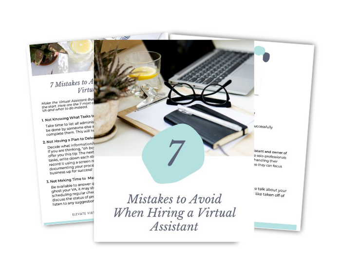
Offer the user a taste of your expertise, for free, in exchange for the their email. A lead magnet or “freebie” can be in the form of a one-page check list or a short guide to something related to what your ideal audience is interested in. Capturing their email also allows you to stay in touch with them and continue to provide value.
Client testimonials or case studies
We know how valuable reviews are these days. People who don’t know you personally may want to know how you have helped others before engaging with you. Gather testimonials from your LinkedIn profile, Google My Business page or thank you emails sent from happy clients and display them on your website.
Options to connect
I find it suspicious when a business’ website makes it difficult get in touch. Provide your email address or a contact form where users will easily find it. Links to your social media accounts are nice to have as well.
Bonus: Make it mobile friendly
Approximately 50% of all web traffic originates from mobile devices so make sure your site is mobile friendly. Your web builder will be able check responsiveness on mobile and tablet.
Your website may be your key marketing tool. Optimize it so that it works for you.
It is no coincidence that I chose to write about this topic because I have been in the thick of it, redesigning and relaunching my own website. A big thank you to Lady Boss Studio and Donald Miller for providing the framework to get this done. Now that you’re here, I’d love for you to take a look around and let me know what you think.
What I Can't Stop Talking About
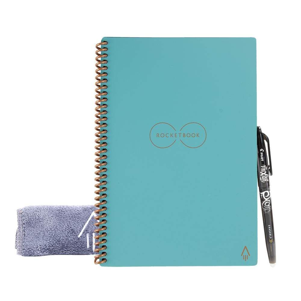
RocketBook Notebook
Rocketbook is a reusable, scannable notebook made for the digital age. The pages are made with synthetic materials and comes with a special erasable pen allowing for endless reuse. Scan your notes to your digital file storage location or email from the Rocketbook App on your phone. I send my notes to DropBox and Evernote. When you are done, erase it with a damp cloth.
It comes in different sizes to accommodate your work style. I like the half size. Check it out here. If you decide to purchase one for yourself (it also makes a great gift) using this link, I will earn a small commission.


